

The Vavengers’ brand refresh and how it was made for everyone

The Vavengers’ creative history
I’m Megan, Art Director of The Vavengers. This role might seem unusual for a team with only 5 part-time employees, but it’s the result of an organisation that has its roots in art and values creativity – whether that be visually or strategically – in everything we do.
I am very excited to launch a visual brand refresh for The Vavengers and thought it would be interesting to go through some of the decisions and why they were important for us.
The Vavengers have existed as a collective for over 8 years now and we have always taken pride in the fact we look a bit different to other charities. This is thanks to our beautiful beginning. We started with events, working with artists and creating spaces filled with people, music and visual and performative art. Spaces where people listened to survivors' stories and felt comfortable to learn and empowered to act!
I first joined the Vavengers as a volunteer 3 years ago, beginning with the offer of graphic design support and a firm stance that ‘I [would] do anything but the social media’. Ironically I eventually took on our social channels and began a whirlwind journey learning about marketing strategy, paid media and the mystery of the algorithm. 2 years later I became Head of Design and Marketing and one of our first 3 paid employees. So far, I have explored how my approach to visual communication - the result of a graphic design degree - could be used for written communication. I have challenged myself to build a brand voice that embodied The Vavengers’ values and Theory of Change and and we have become a unique voice in the sector. I love working on the research, ideation, copywriting and designing of a project, it’s only when it reaches the algorithmic strategy side that my skills and interest diminish. In the last month I made the move to my current role as Art Director and made way for a skilled Marketing Manager – enter Ellie!


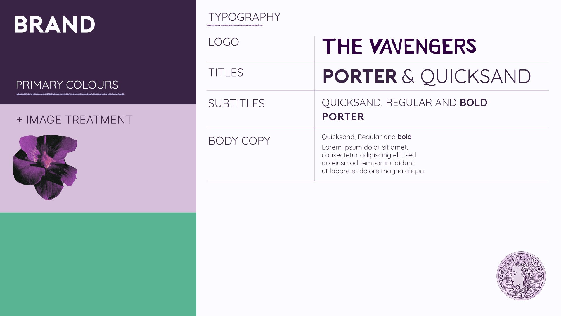
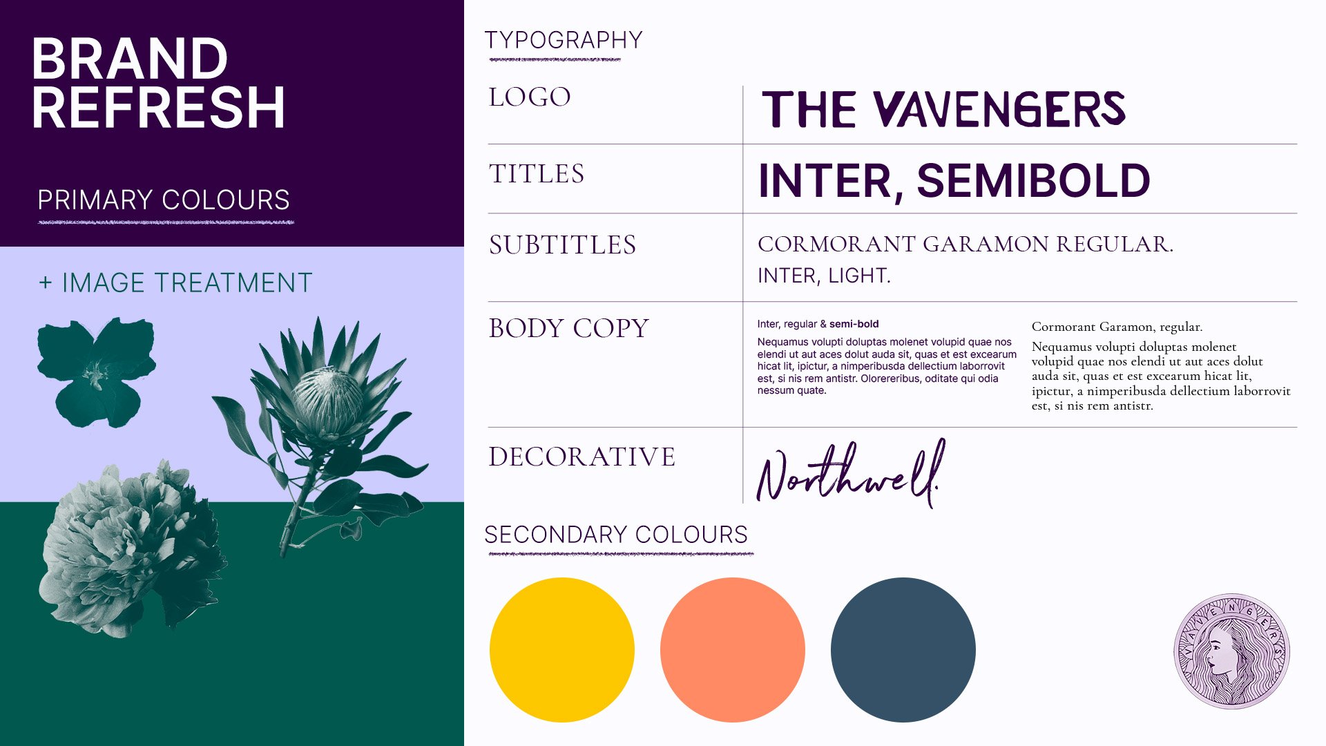
When I joined The Vavengers we had our gorgeous logo [above, left], a logotype [above middle], 2 typefaces [top left], a selection of floral patterns [above right] and an obvious attraction to purple – all thanks to the artist and Vavenger Hugo Winder-Lind. These elements have served us so well, and gained many a compliment from those that meet us. But over time I felt the creative restrictions that came with them and, more recently, began to understand that our visual approach might not work for all the people it interacts with.
Our creative future
Last year the decision was made to give our brand a refresh, and with this came the challenge of balancing 3 things; the Vavengers’ iconic look and feel, a new palette of visuals, and making it acessible.
Accessibility Noun
The quality of being easily understood or appreciated.
Accessibility means taking into account the range of unique needs that people have so everyone can access what you’re offering – an approach that could also be described as considering the ‘furthest first’. The needs most significant to us to consider were those with visual impairments and people who aren't fluent in English. Certain colour combinations, excessive patterns and intricate or small text can be difficult to read for these audiences and for now, the most significant decisions that this affected were with colour and typography.
Colour
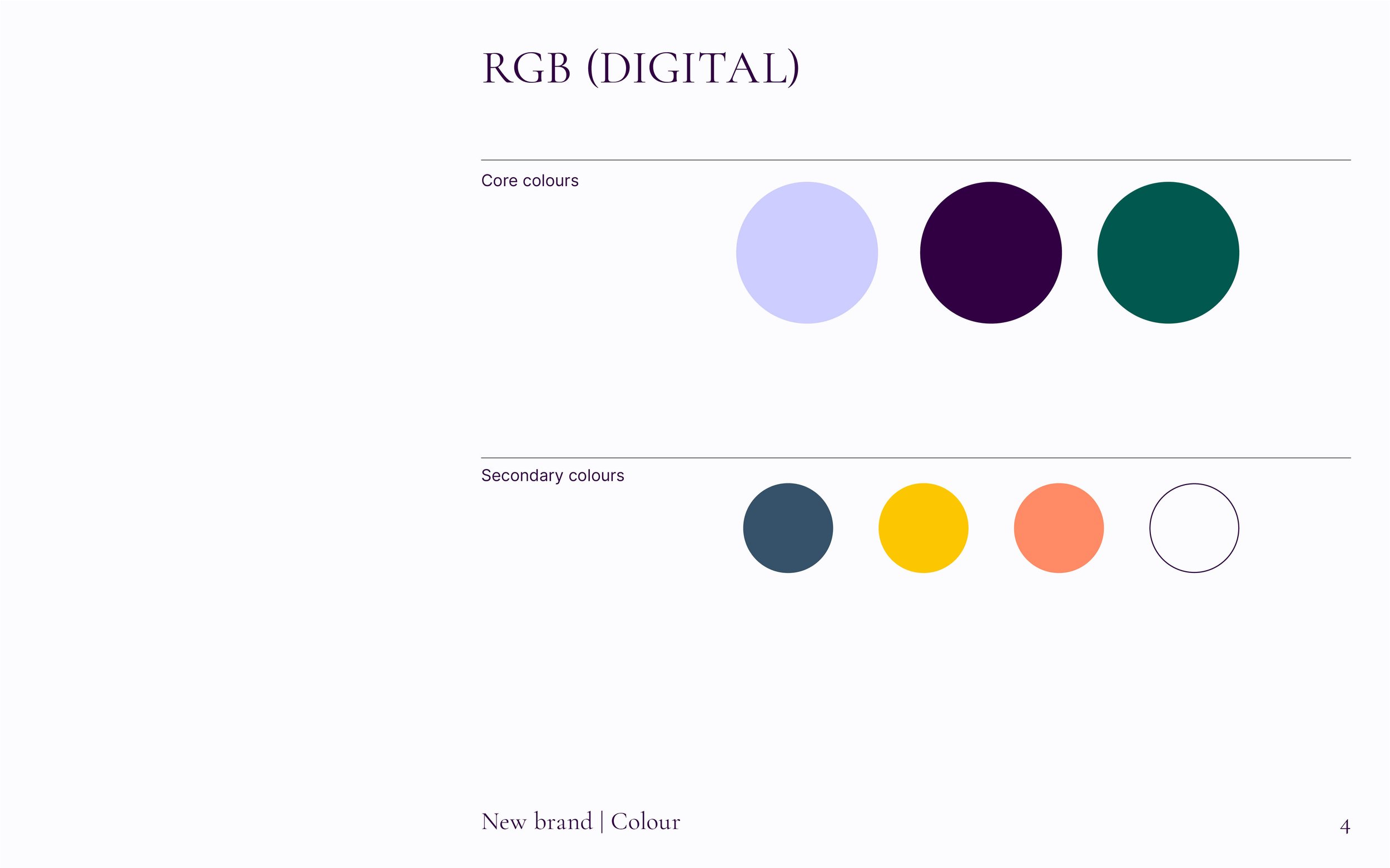
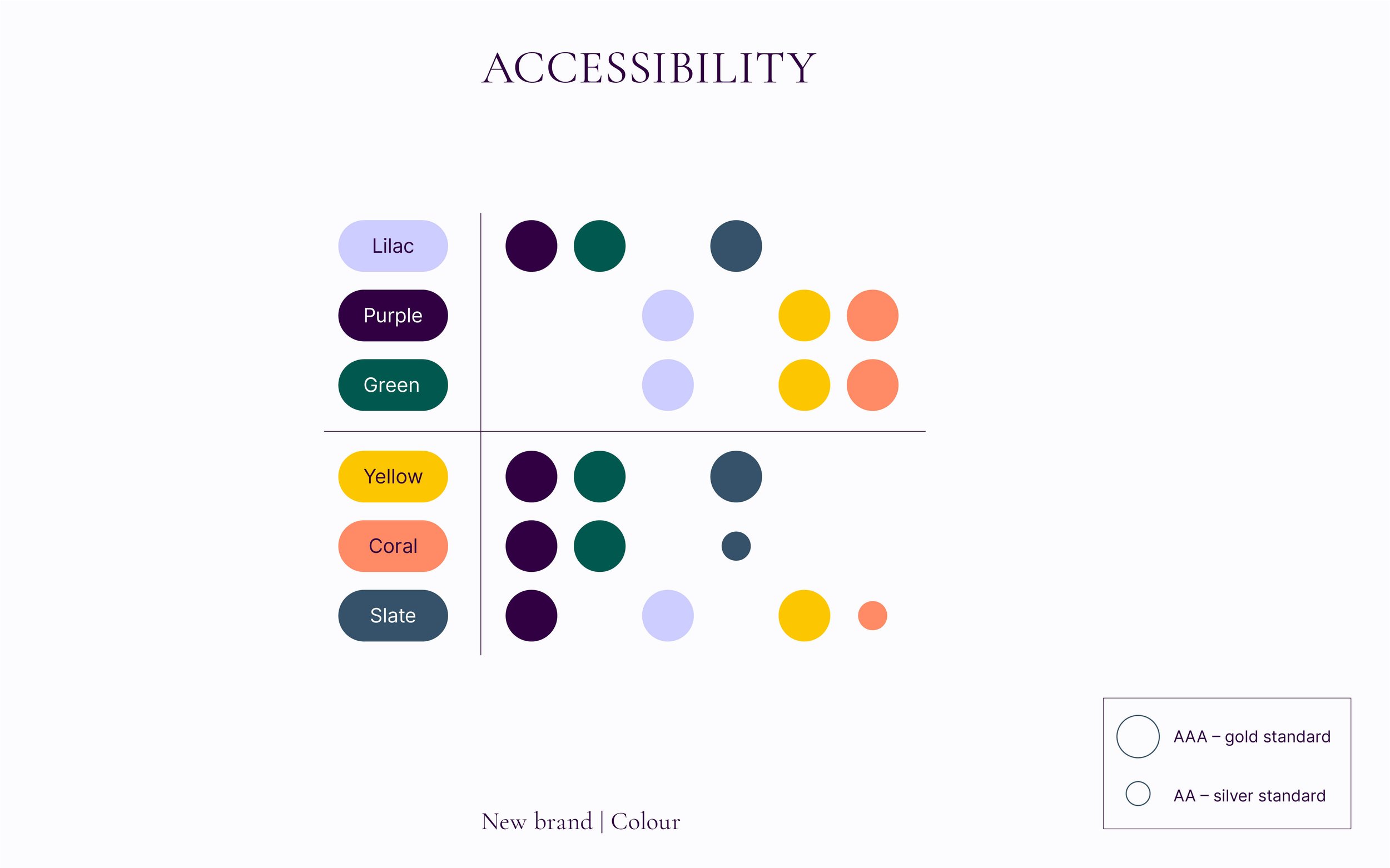
There are web accessibility guidelines that set a standard for how digital design can be accessible. Brilliant interactive tools have taken that standard and can tell you whether a colour combination will be accessible for visual impairments and people who are colour-blind. AAA or AA grade is reasonably accessible. The table below [right] shows which of our colours can be used together to ensure an accessible combination.
Typography
Then through research we found some simple rules to guide typography:
Avoid long sentences or paragraphs in all-caps
– Our old typeface ‘Porter’ is only in capital letters, and doesn’t have any punctuation, so this can be very problematic for the aforementioned audienceAvoid italics
Only bold parts of a sentence or individual words, never a whole paragraph
Avoid using handwritten text or script fonts
– We do use a handwritten typeface [Northwell, below] but are conservative with its use, only for headings or as part of an illustrative piece

We are also looking at modernising our logo to make it more legible and in the meantime opt for using the logotype [above] on smaller assets.
A big piece of work we undertook in the past 6 months was updating our website. The site was co-designed by me and our multi-skilled CEO Sema, curated in consideration of all users who visit our website – from funders and supporters to beneficiaries and activists. This was both an opportunity to trial our new brand look and feel and a necessary step in our development as an organisation. Our growth since has been remarkable. Our positive interactions with funders and the successful launch of our support hubs are a testament to the impact a cohesive and user-friendly website can have.
In all areas of our work, The Vavengers are continually learning and changing and we will always strive to have a visual identity that reflects that while being exciting and accessible to everyone.
Want to talk more about how your communication might be more accessible? Get in touch: megan@thevavengers.co.uk. And we hope you enjoy our new look!
Credit
Blog Author: Megan Barclay
Brand & Image Designer: Megan Barclay